Warm up

|
Fun Fact Project.
Search for an interesting FACT to use for this project. Using the photoshop methods we discuss in class, create a combined image. You must combine at least 2 images into one. Bonus points for combining more than 2. Extra bonus points if you use your own photographs. You must include at least 2 images The final presentation should be created in Illustrator or InDesign with a colored background. |
Preparation
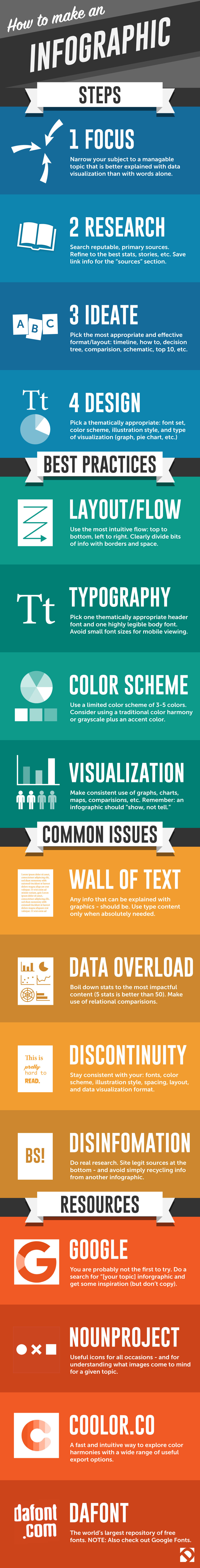
Charts are some of the best graphical representations of data we have. Designers use statistical graphics as a way to measure and display information. Learning how to effectively display information is an important part of the basics of graphic design.
For this project you will be researching and charting information in a visually interesting and clear way.
Steps:
1. Brainstorm a theme for your research. You will be surveying other students to get information about your chosen topic.
2. Choose one question that has a measurable answer for your survey.
For example, you can ask how many students have visited an area outside of the Berkshires in the past year.
Consider details about your chosen topic that might make the outcome more interesting that you will ask in your survey. (see next step for clarification)
3. Organize your information into categories if possible.
For example: Out of those surveyed, how many students are female? How many students are from Sheffield? How many students have traveled once, twice, more than three times, etc.
4. Decide which type of visual display would work best in presenting your information.
5. Use Adobe Illustrator to create your chart or graph.
Consider:
color
type
unique shapes and lines
Include:
title
subtitle which further explains your chart/graph
explanation of units of measurement
author (you)